PocketChange
A mobile app for achieving financial saving goals
Project Overview
Objective
Create an app to help people save money quickly in preparation for a big purchase or expenditure. The users are familiar with technology but do not like working with their finances, so they require the information they receive via the tool is personalized, accessible, and clearly tells them what they can do to save.
Concept
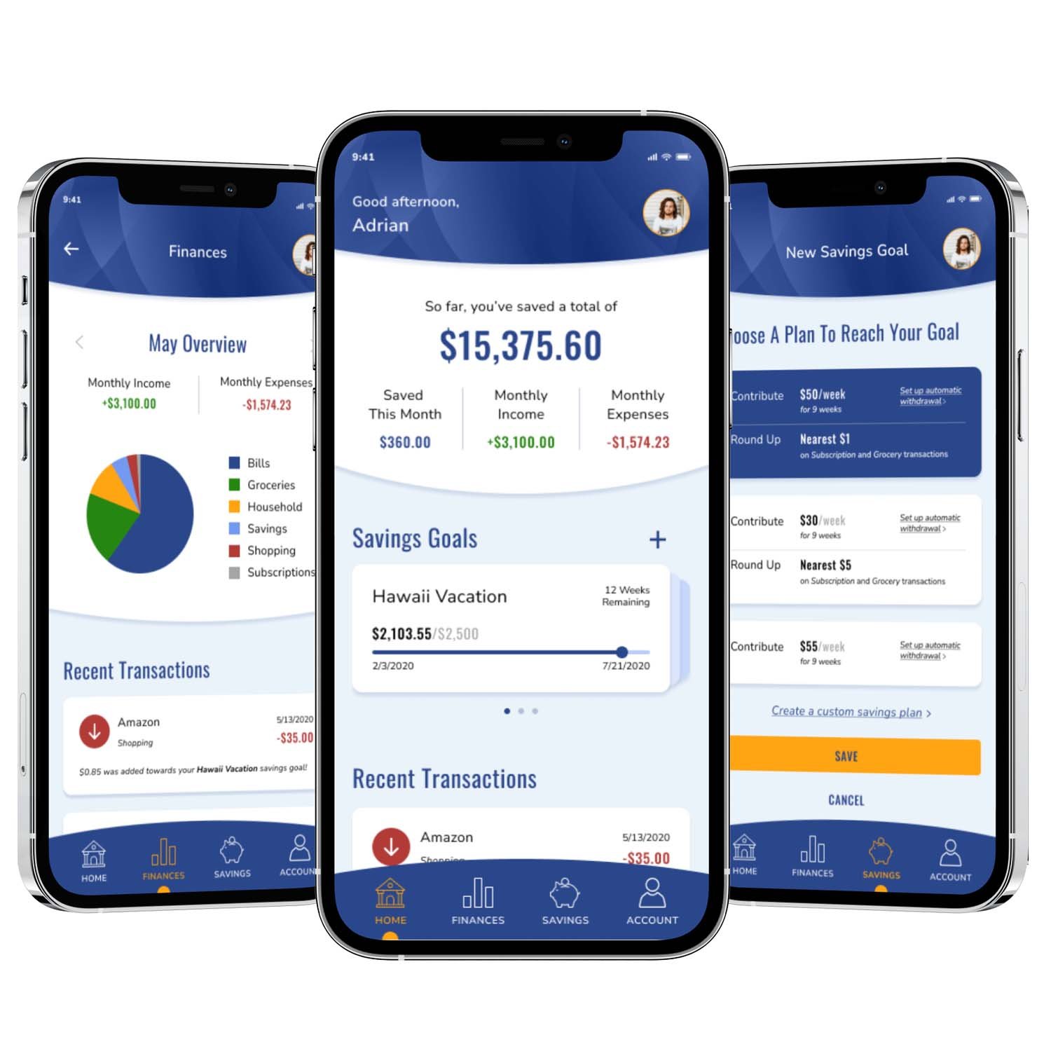
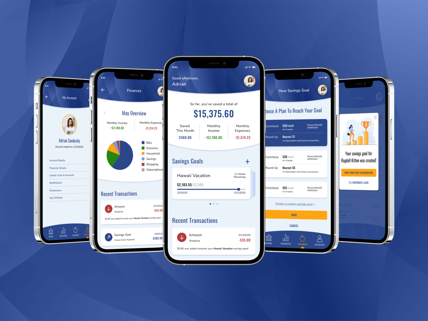
PocketChange is an app that makes saving simple by analyzing a user’s financial data and providing them with customized savings plans to choose from when they create a new savings goal. Plans include a combination of weekly or monthly contributions (these can be automated) and rounding up to the nearest $1, $5, or $10 on specific transaction types. Users can choose from the suggested plans or create their own. Milestone notifications reward the user for staying on track with their savings plan and keep them motivated to reach their goals on time.
Accessibility
To ensure the app is accessible, both in content and functionality, I used the plugin Stark to check that all color contrast ratings are a minimum of AA and designed touchpoints on mobile screens to be a minimum of 40px by 40px.
Role
UI Designer
Visual & Responsive Design
Graphic Designer
Logo & Brand Standards
Tools
Figma, Adobe Illustrator, Adobe InDesign
Team
Self-directed, with feedback from mentor and peers
Prototype
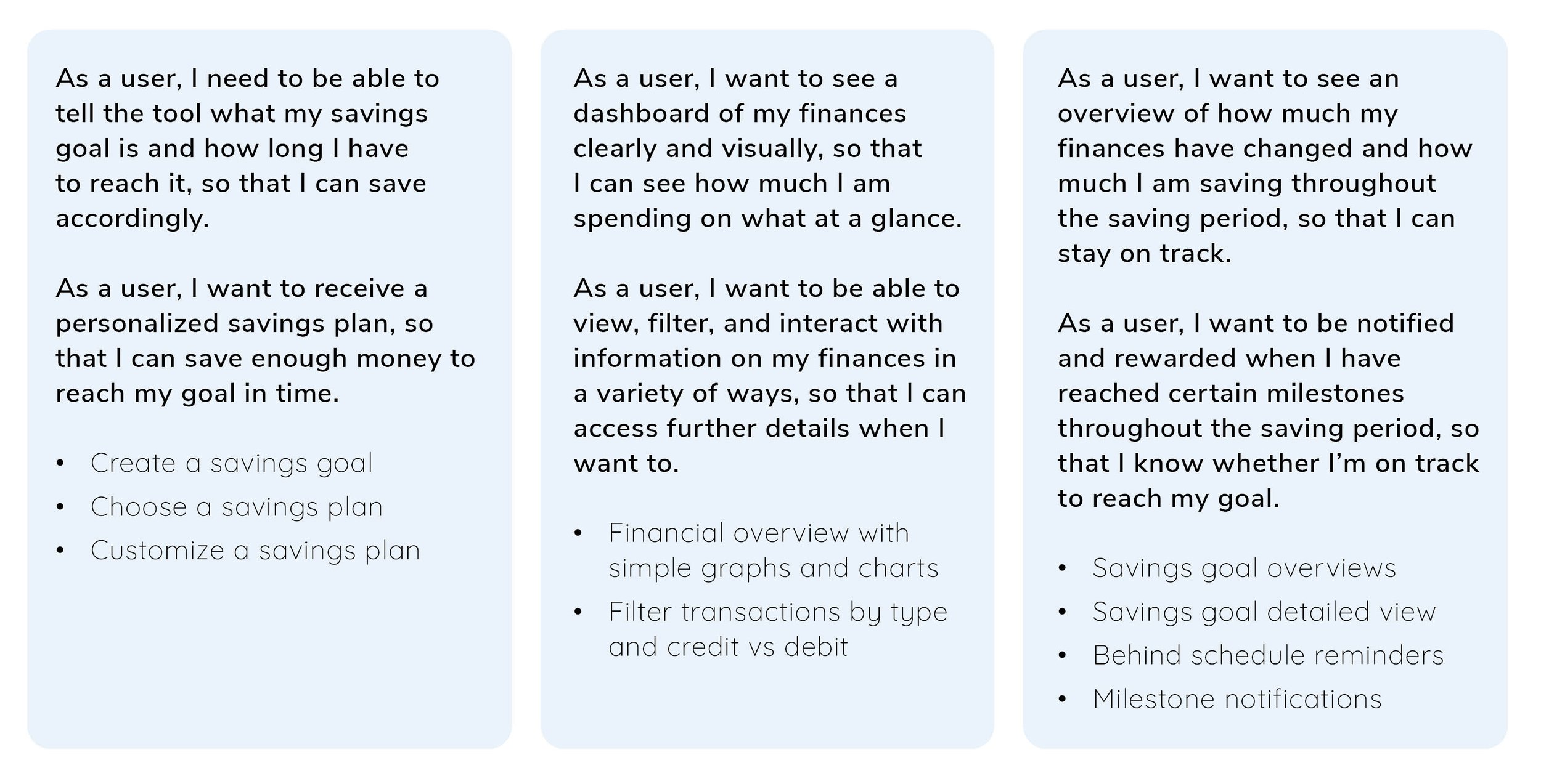
Gathering Requirements
WHO is the user?
This tool is for people who want to save money, quickly, for a particular reason, such as a wedding, vacation, or new car. They are comfortable with technology but do not like working with their finances.
WHAT will the product do?
A responsive mobile app that displays data on the user’s finances (how much money they spend and on what), and tells them what they can do to cut costs and save money in a certain amount of time.
WHERE will the product be used?
The app can be used from anywhere and using any mobile device to ensure income and outgoings are easily recorded.
WHEN will the user need the product?
Users will utilize the tool in the period before a planned expense to view accurate information on their finances and dynamic information on what they can do to save more money.
WHY does the user need the project?
Saving money can be really hard, especially when you don’t have a long time to do so. By providing personalized information on how a user can save based on their actual finances, the tool itself can provide financial advice during these finite periods of saving.
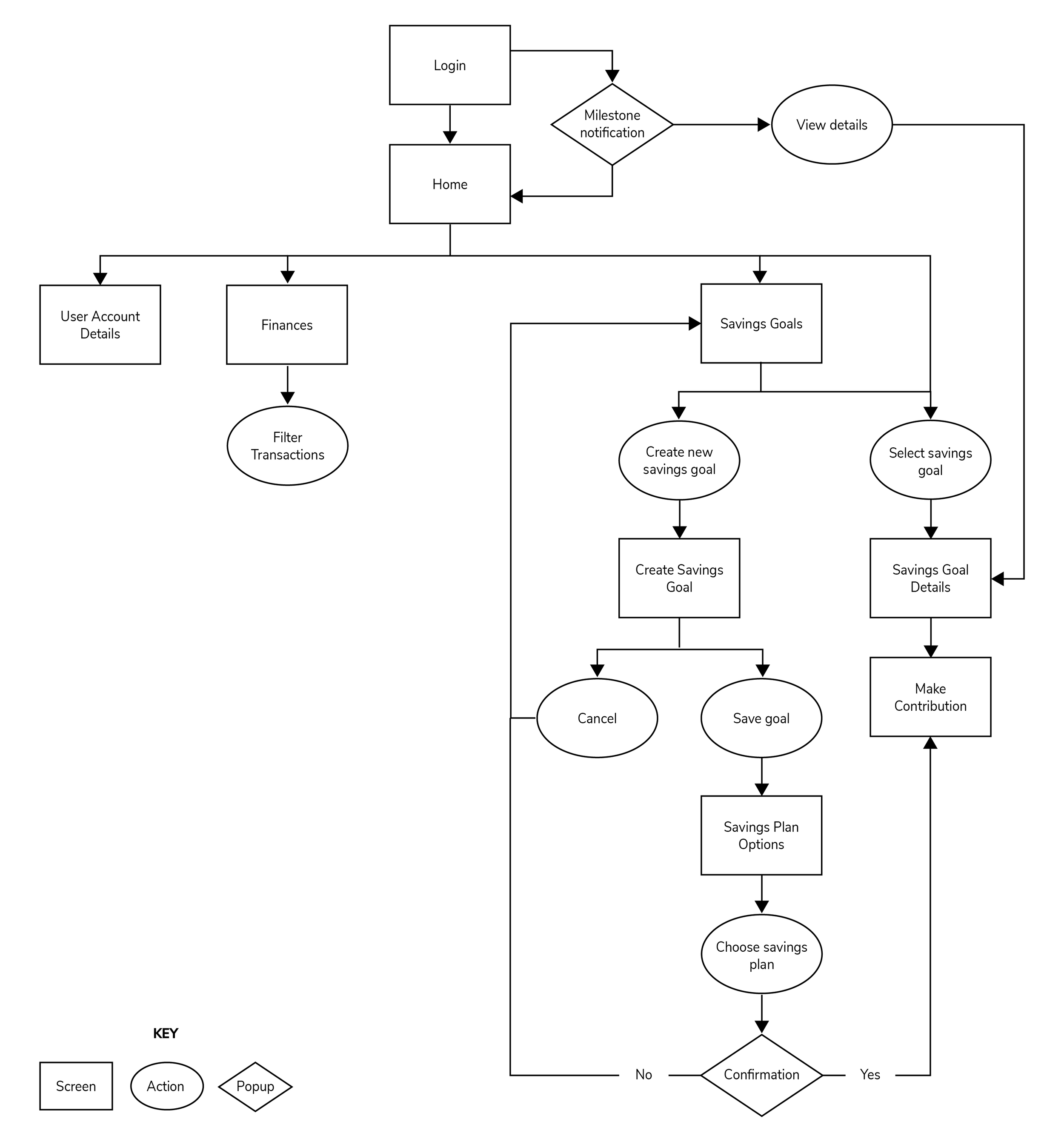
Jobs To Be Done, MVP, & User Flows
Using provided jobs to be done statements, I determined the minimum feature set for the app, which included financial and savings dashboards, personalized savings plans, and filtering options for financial data and transactions. I designed user flows for each feature, then combined them to create an overall user flow diagram.
Logo & Branding
Using the brand description and key messaging that was provided, I created a logo and brand standards for the PocketChange brand.
Brand Description: Users will be inputting personal and financial information, so they will want to use a product they can trust. Just like you’d look for in a real financial advisor, the product should be considered reliable and serious and should build confidence in its users. We are largely appealing to those less familiar with the world of finance, so we must convey simplicity and clarity through our brand.
Wireframes & User Testing
After the brand was finalized, I created wireframes for each of the user flows. I started with low-fidelity sketches to establish the basic design and content, then built mid-fidelity versions in Figma. After those were complete, I created a prototype and tested the user flows to make sure they were intuitive and easy to use. Based on the feedback I received, I then revised my mid-fidelity prototypes before moving on to final high-fidelity screens using the color palette and image guidelines laid out in the brand standards.
User Testing results & revisions
Wireframe Progression
High Fidelity Mockups
Responsive Landing Page
As a final deliverable, I created a responsive landing page to promote the app and encourage users to download it from the Google Play or Apple stores.
Retrospective
What went well?
The overall design for this app went very smoothly. User testing showed that the flows worked well from the beginning, with only minor changes required to design and content phrasing. Establishing the brand early made it easy to create the high-fidelity designs and the brand itself worked well with the overall concept of the app.
What didn’t go well?
Early sketches for the screens took some time, as I had to familiarize myself with the structure and content of existing financial apps, then decide what features and patterns worked well and what I could improve upon. Taking the time to explore and get it right at the low-fidelity stage made the rest of the design phases go much more smoothly though.
What could be better?
I would love to do additional long-term user testing to see how effective the milestone notifications and reminders to stay on track actually are for users. With data from long-term users, I think the motivational aspect of the app could be improved.