Forte
An 80s themed music player app
Project Overview
Objective
To design the UI for an 80s music player mobile app with a target audience of 35-55 year olds.
Concept
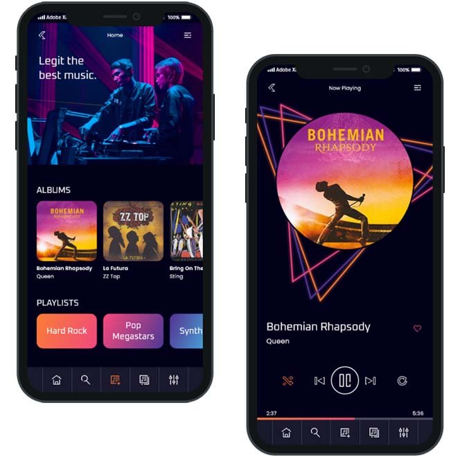
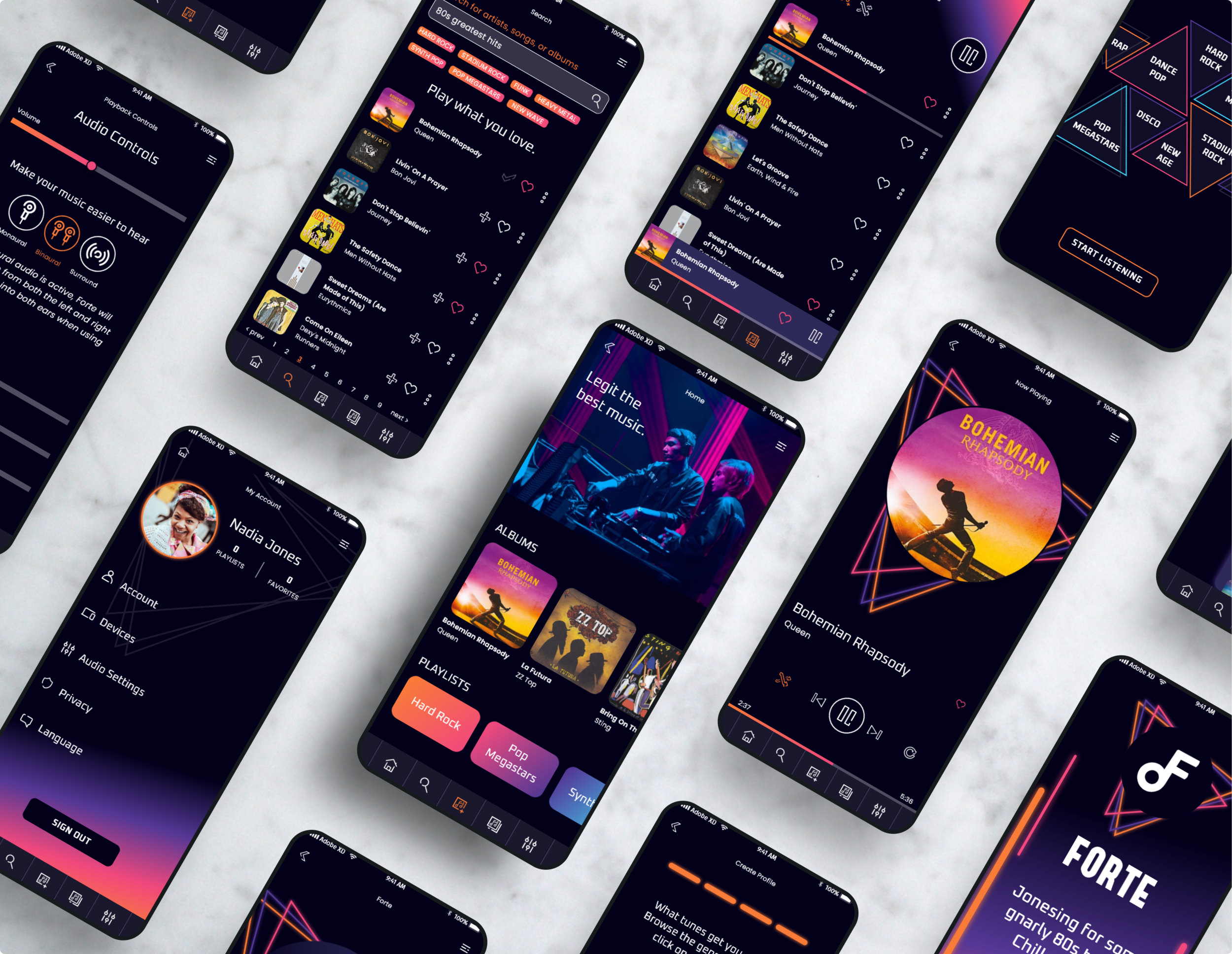
A vibrant design with geometric patterns, reminiscent of of the atmosphere in an 80s dance club. Boombox-esque navigation buttons bring a sense of familiarity for users who grew up listening to music on physical devices. Intentional use of color guides the user through the app’s most essential functions, providing ease of use for a generation who may be less comfortable with digital technology.
Accessibility
To ensure the app is accessible, both in content and functionality, I used the plugin Stark to check that all color contrast ratings are a minimum of AAA, designed touchpoints on mobile screens to be a minimum of 40px by 40px, and included audio control settings to allow customization for users with partial hearing loss.
Role
UI Designer
Tools
Adobe XD, Adobe Illustrator
Team
Self-directed, with feedback from mentor and peers
Mood Board
Low-Fidelity Wireframes
Mid-Fidelity Wireframes
High Fidelity Wireframes
Retrospective
What went well?
The design evokes nostalgia for the neon aesthetic of the 80s music scene and also for the technology that target users would have used to listen to their music. Tailoring those elements was easier due to the specificity of the target audience.
What didn’t go well?
Artwork for 80s albums varies widely in style. Designing an interface that evoked vibrant 80s vibes and still paired well with all album covers was a challenge! It took several rounds of revisions before I felt like I had achieved both objectives.
What could be better?
I would love to do user testing to see how well the app performs with target users, since their comfort with technology can vary widely. There are likely some improvements that will need to be made to address pain points that are difficult to identify organically.