Cheers
A responsive drink recipe app for planning and elevating event menus
Project Overview
Objective
Although convenient, there are a large number of recipe apps on the market that do not meet the needs of their users. Your solution involves the creation of a responsive web app that will meet these needs and solve the problems they are currently facing.
Concept
Cheers! What’s better than gathering with friends or family to celebrate a special event, host a dinner party, or have a game night? A party with good food AND good drinks. Cheers is a drink recipe app that can be used to easily add specialty drinks to a menu. With something for everyone, the app offers both alcoholic and non-alcoholic options, with filters for preparation time, food pairing, and dietary restrictions.
Accessibility
To ensure the app is accessible, both in content and functionality, I used the plugin Stark to check that all color contrast ratings are a minimum of AA, designed touchpoints on mobile screens to be a minimum of 40px by 40px, and included prominently featured non-alcoholic recipes, as well as the ability to filter for dietary restrictions.
Role
UX Designer
Competitive Analysis, User Interviews, Product Design, Prototyping, User Testing
UI Designer
Visual & Responsive Design
Tools
Figma, Adobe Illustrator
Team
Self-directed, with feedback from mentor and peers
Interactive Prototype
Gathering Requirements
WHO is the user?
Someone who is planning an event menu that includes specialty drinks.
WHAT will the product do?
Allow the user to easily add specialty drink recipes to the menu for an event by offering a robust database of drink recipes with search and filter options tailored for event planning.
WHERE will the product be used?
During event planning sessions, in a home or prep kitchen when preparing a meal, or in a grocery store while shopping for ingredients.
WHY does the user need the product?
To elevate their event menus and make their gatherings memorable, even last-minute.
WHICH platform and devices will the product live on?
This is a responsive web app that will be accessible on any browser.
User Personas
After conducting user interviews, I synthesized that data into three user personas that personify the key audience segments, who range from industry professionals to those hosting for the first time. The personas guided my design decisions, ensuring that the app would be equally useful and enticing to experts and beginners, as well as anyone in-between.
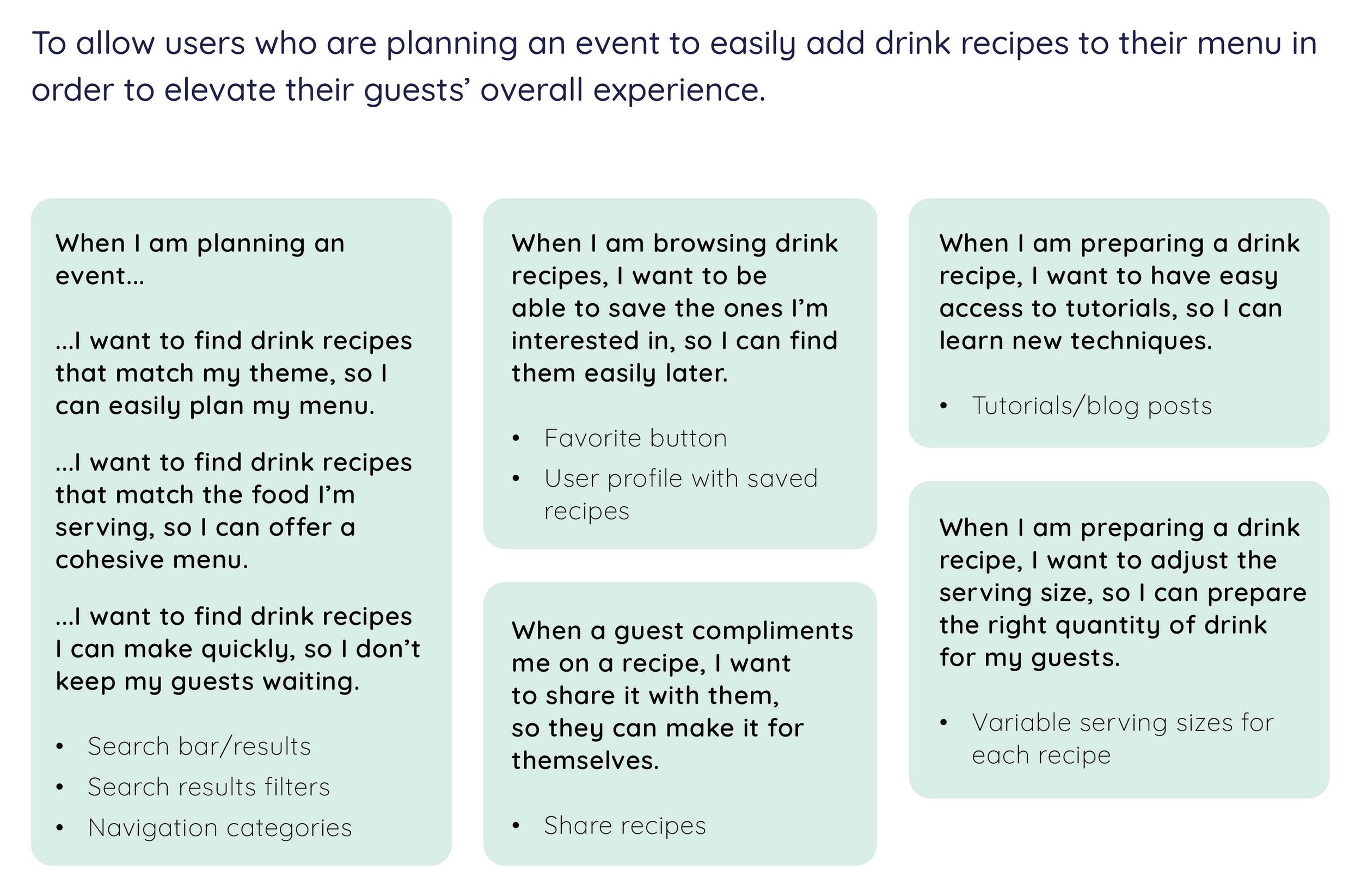
Jobs To Be Done, MVP, & User Flows
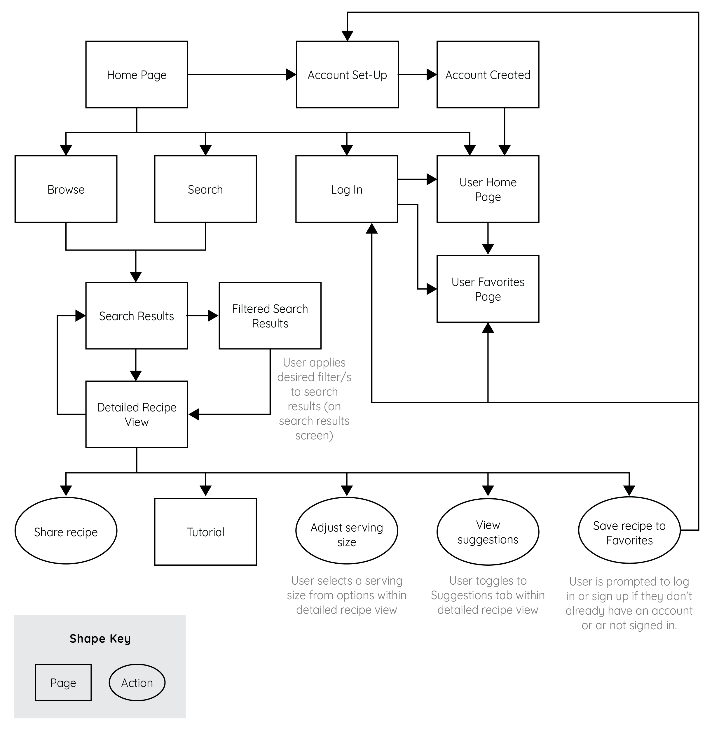
Once I had user personas, I used them and my research to define the potential jobs to be done for the app. I found that the total JTBD exceeded a reasonable scope of work for initial implementation, so I refined them to a minimum viable product, making sure to include the essential features a user would need when planning and hosting an event. Using the MVP as a guide, I then created user flows for each JTBD.
Low-Fidelity Wireframes
After creating the user flows, I used the Crazy 8s method to sketch low-fidelity screens, making sure to include the elements and functionalities identified in the flows and through my research. After sketching, I sorted through my designs to choose the most successful, then iterated until I had all required screens sketched. I then created a simple prototype and performed some basic user testing, followed by additional iterations to address any concerns or confusion the testers expressed. Most testers went straight for the search function or preferred to browse the options presented on the homepage, so those were two areas where I further refined the content and positioning.
Mid-Fidelity Wireframes
Once I had a visual direction for the layout, I added more details to the sketches by turning them into mid-fidelity wireframes, making sure to include any revisions to the layout or content from the user testing done on the sketches. These allow me to ensure consistency and establish a visual hierarchy before applying color or styling. I also ran some preference tests on screens such as the search filter options to test functionality, then revised the designs accordingly.
Style Guide
With the layout of the app established, I expanded the original mood board I created for the app to create a full visual style guide, defining typography, icons, colors, buttons and inputs, and imagery requirements.
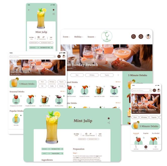
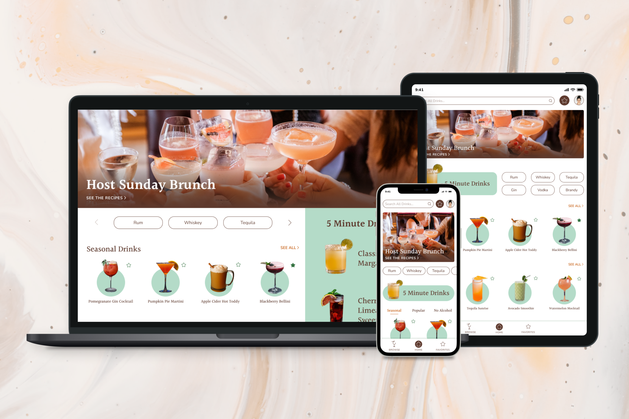
High Fidelity Wireframes
Retrospective
What went well?
The user interviews allowed me to pinpoint which features were the most important to develop for the initial launch, and frequent user testing at all phases of design helped to refine usability.
What didn’t go well?
Designing the UI required a few iterations to create a responsive design that matched the vision established in my mood board. Since the app focuses so heavily on drinks for specific types of events, I needed to create a color palette and drink photo presentation that could accommodate all different types of themes, from Halloween and Christmas to garden parties and game nights. It took me a few tries to find something that worked well.
What could be better?
The browse option could be refined to do a better job of presenting a large amount of options in a small space. User testing showed that users were highly likely to either scroll the homepage or search to find recipes, so I didn’t prioritize the browse feature, but I think the information hierarchy of that section has room to be improved.